ArtifactFisherman
Note: You are viewing an old revision of this page. View the current version.
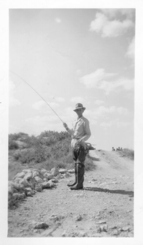
I think this image makes good use of the rectangular frame. Notice the other heads just poking out above the rise behind the main subject.

Certainly the contrast isn't great - his head is lost in the shadow. If only we could reach back in time and use a little fill flash.
When I first started examining these pictures, I was excited because of the large negative size (about 1.75" x 2"). However, I quickly discovered that while the amount of detail in the negative was great, the lens was very inferior to what we are used to today. Notice how everything goes blurry around the edges, for example (particularly evident in the foreground).

